Mobile-First: Is Your Website Built for the Pocket?
Imagine your website is a store. Is it a huge mall that's hard to navigate, or a convenient shop that fits right in your customer's hand?
Kshithij Anand Belman
May 2, 2026
⏱ 6 min read
The Pocket Store
Think about the last time you wanted to buy something or find an answer. Did you walk to your computer, turn it on, and wait? Or did you just pull your phone out of your pocket?
Most people today use their phones for everything. If your website is hard to use on a small screen, it’s like having a store with a door that’s too heavy to open. People will just walk away. "Mobile-first" means we build your website for the phone first, making sure it’s easy and fun to use.
"Your website should work as hard as you do—starting with the screen in your customer's hand."
60%
Use Phones Only
Web Traffic 2024
3 sec
Patience Limit
Before users leave
80%
Better Sales
On mobile-ready sites
1. Big Screens vs. Small Pockets
In the past, websites were built for big computer screens. When you looked at them on a phone, the text was tiny and you had to "pinch and zoom" just to read anything. It was frustrating!
Now, we do the opposite. We start with the phone. We make sure the most important buttons are easy to find and the text is big and clear. This makes the website feel like a native app on your phone, not a shrunken-down computer program.
A clean design on a phone makes your business look professional and trustworthy.
2. The Need for Speed
Have you ever waited for a website to load while standing in line or walking? Even a few seconds can feel like forever. If a site is slow, most people will just click the "back" button.
Google also knows this. They reward fast, mobile-friendly websites by showing them first when people search for things. If your site is fast on a phone, you get more visitors for free!
⚡
Instant Load
No more waiting. Your site opens as soon as they tap.
🔍
Top of Search
Google loves mobile-first sites. We help you stay on top.
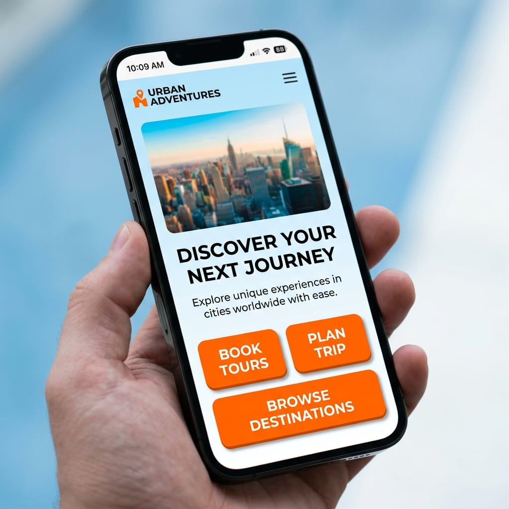
3. Easy to Tap, Easy to Buy
Mobile-first isn't just about how it looks; it's about how it works. On a phone, we use our thumbs, not a mouse. Buttons need to be big enough to tap without hitting the wrong thing.
Mobile-first strategy isn't just about design—it's about driving real business results.
When your website is easy to use, people are more likely to call you, sign up, or buy from you. It’s that simple. By making the experience smooth, you turn visitors into happy customers.
Interactive Lab: The Thumb Zone
See why "Mobile-First" is better for your hands. Use the buttons below to switch designs and see where your thumb can reach easily.
HARD TO REACH
EASY TO REACH
Final Thoughts
READY TO OWN THE POCKET?
Building a website for the phone isn't just a technical task—it's about making your customers happy. At Belmans4Business, we make sure your "pocket store" is the best one in town.